Palate vs. Palette
Execution.
Inspired by Cereal magazine, this project imitates a guide to educate readers about color palettes versus taste palates of the Italian culture. This editorial design and copywriting may give readers a new perspective which they may apply to any specific region they have the desire to explore. With this approach, travelers will learn how cultures intertwine but remain unique among all, the next time they experience a new culture and way of life.
Copywriting
Every culture is shared, learned, and taught among generations. Contrary to popular belief, it is continuously evolving. Relating color palettes to taste palates of a region, will serve as a unique approach to documenting what one discovers while traveling into new territories.
Editorial Design
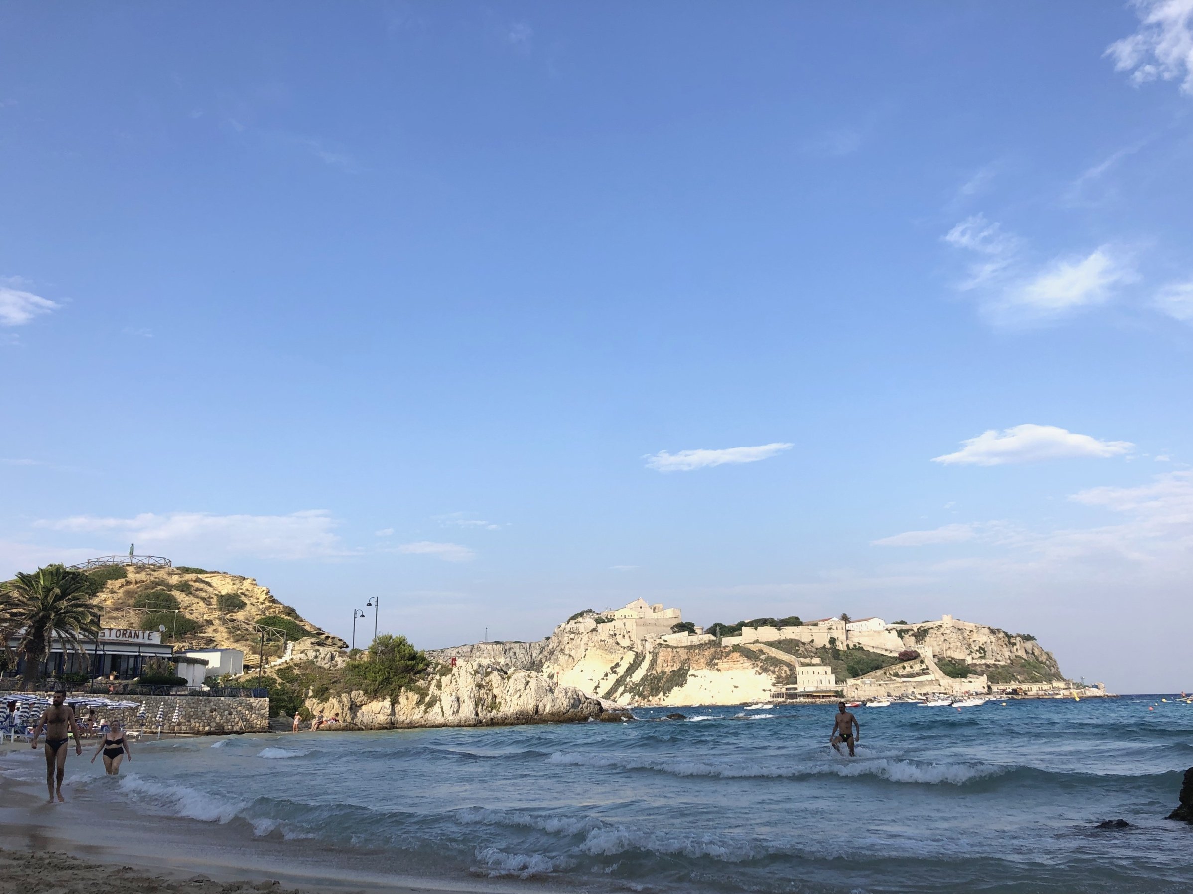
Photography is an essential element in telling a story through an editorial layout. These pictures are inspired by Cereal magazine’s aesthetic, and portray the feeling viewers may have while exploring Italy and its people’s culture.


